Jan. 28, 2019
In the simplest terms, a design system is a collection of reusable, repeatable components – building blocks, and the code that goes with them – along with the standards and guidelines for their use. By taking these components and organizing them to meet various system requirement, the possibilities of what can be created are nearly unlimited!
At Indiana University (IU), we have Rivet (an internal design system) which is being designed and developed by folks in the User Experience Office (UXO) in collaboration with designers and developers across IU.
From the Rivet website, Rivet defines itself as:
“a focused set of front end UI components, as well as a place for documenting good UX, accessibility, and design practices. It serves as a developer’s guide for when and how to use certain patterns and how to implement them in an accessible way.”
With this baseline understanding of what a design system is, let’s look at some of the things design systems can do for us – practically speaking, the benefits of using a design system.
There are many benefits associated with using a design system for software development. This post will only review a few of the high level benefits to set the foundation for our discussion.
First, we’ll look at benefits that apply specifically to designers and developers that are tasked with creating online applications.
Consistency
Consistency. This benefit is probably pretty obvious to most: When we use a design system, we automatically get a good level of consistency within an application as well as across a suite of applications . Using the basic building blocks in the design system means a button is a button is a button. For developers and designers, this means It is not necessary to reinvent the button (or a dropdown, or a text field, or any of the other basic components) every time you need to include one on your interfaces.
In addition, by using components from a design system, various states of the components are built in. The designer and developer don’t have to worry about determining the look of and creating the hover state, the disabled state, the pressed state for each interactive component – it’s included!
Color
Another prominent and very obvious benefit has to do with color. There are a lot of factors to consider when selecting a color scheme for applications – for example: the number of colors to include. Too many or too few colors can seriously impact the usability and effectiveness of your interface. Likewise, contrast, legibility, color blindness, the target audience and cultural or emotional significance of colors, etc. must all be considered. There is a lot to evaluate. When you use a design system, you gain an established color scheme to work with. These factors have already been evaluated and appropriate options determined.
Beyond the factors associated with color itself is the fact that when color is used in an application, it should have meaning. The colors should indicate something to the user and that meaning should be consistent throughout the application.
Some examples of consistent color use include:
Again, with a design system - all these factors have been considered - this takes a huge task off the designer's and developer's plate. A bit more information on color is provided below in the section discussing the benefits of consistent color use for our end users.
Accessibility
Accessibility - a word that we hear and read about more and more. Accessibility is all about creating products that are usable by people with the widest possible range of abilities, operating within the widest possible range of situations. Making things accessible to as many people as possible is of utmost importance and a goal that all our software teams should have.
At IU, the Rivet team strives for a base level of accessibility for all components included in the design system. And, while this does not eliminate the need for the components to be implemented correctly with accessibility in mind, it does provide a springboard in the right direction.
Templates for common interface patterns
Design systems also include templates and patterns for common interactions. For example, a standard header and the components that are appropriate to include in it. Footers and necessary information to provide there. Recomended patterns for displaying a search interaction and the subsequent results. Tab structures. Login screens. All sorts of simple patterns that are used over and over throughout our apps. Having these patterns available for designers and developers to use in their interfaces frees them up to concentrate on the more unique aspects of their services.
Bottom line - Less work on the basics
All of this contributes to less work, less coding – less focus on the basics. Freeing the designers and developers to concentrate on other issues.
No need to continuously reinvent the wheel or spend time for each app determining the overall aesthetics or developing those basic building blocks and common patterns. Your application’s foundation is there, providing a good, consistent base to build on.
Let’s now take a brief look at how use of a design system can benefit our end users.
Consistency
Just as consistency provides benefits for developers and designers and cuts down on their work, consistency is crucial to our users. Let’s revisit color and the fact that within an interface, color has meaning and needs to be used consistently.
In Rivet at IU, the interactive color is midnight blue (a color within the IU branding palette). As users explore IU applications, they will quickly learn they can interact with components that are blue. A blue rectangle represents a button and can be clicked on, blue text represents a link, blue icons provide functionality, etc.
Likewise, green is used for success messages, red indicates errors, and warnings are displayed in yellow. In all cases, color used in an application should represent something and that meaning should be consistent from screen to screen and application to application within a suite of services. Users learn these meanings and it helps them more easily traverse each app. If you have ever used a service in which the interactive color or the color of errors changed, seemingly randomly, from screen to screen, you will understand how frustrating and confusing it can be!
Trust
Providing consistent, familiar services can also go a long way to creating trust and confidence with the end user. When the interaction is consistent and intuitive from screen to screen and layout and design are clean and professional, users are more likely to trust the brand.
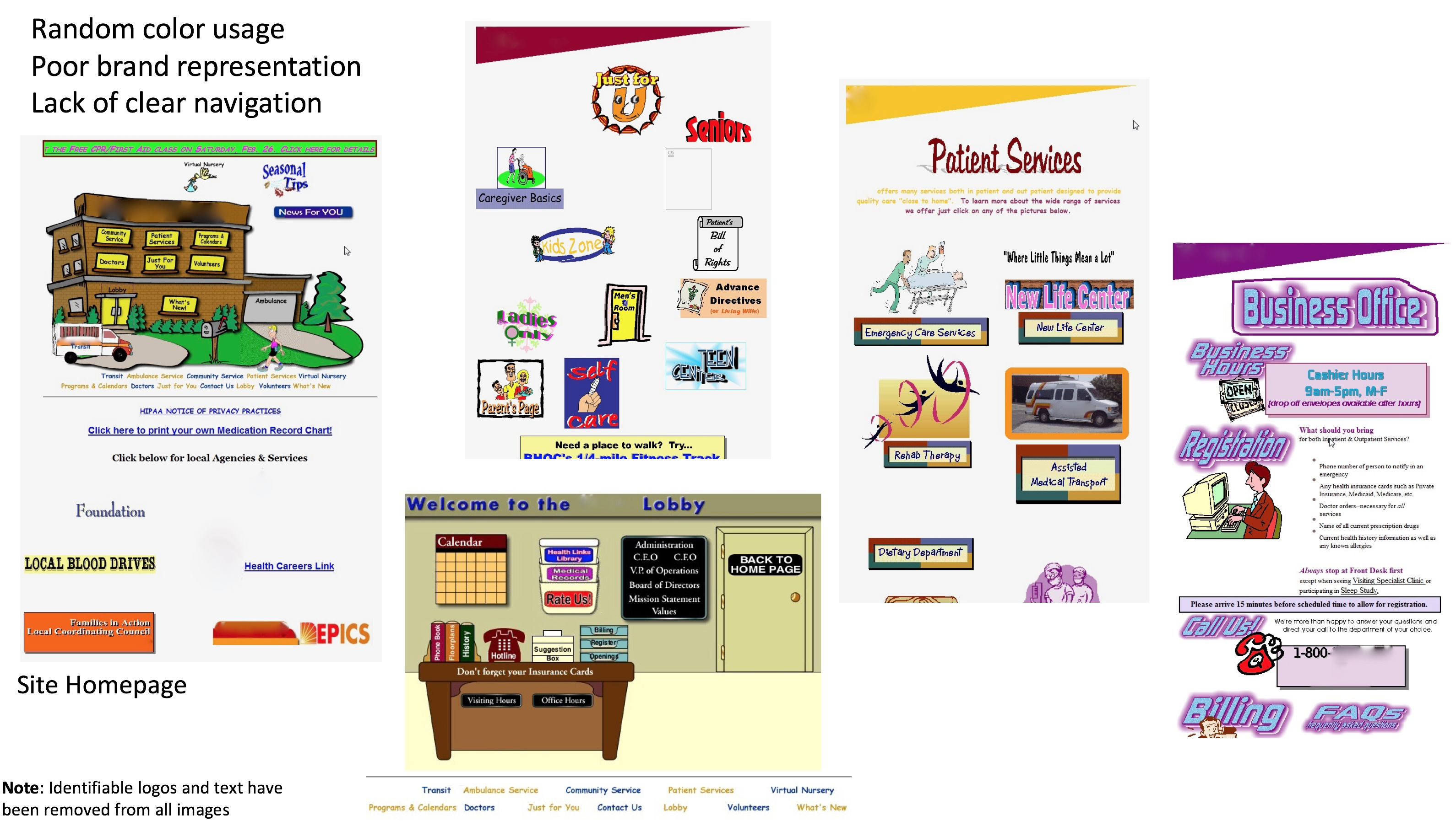
To illustrate this idea, below is shown an example from a medical facility. The site had been designed using clip art, comic style graphics, and a number of poor animations.
The above image shows 5 separate pages from their site, including the homepage (top left) and what they refer to as the lobby (lower middle). There is no consistency in screen layout from one page to the next. Color was used randomly and even their branding banner changed color from page to page (the branding banner is the triangular shape shown at the top of three of the screens above. The logo has been removed to protect the privacy of the client). A clear navigational structure is missing and it is unclear which elements are interactive (clickable). The overall organization of the site content was extremely confusing and users did not understand where to find the information they needed.
The effect on end users that were looking for assistance with, in some cases life-threatening, health issues for themselves or a loved one, was that users felt the organization as a whole was unprofessional and untrustworthy – not just the website. Many said they would travel further distances to find perceived better care than trust this organization that was located within their town. And, I'm sorry to say that this design was live not too many years ago!
We all want our end users to perceive our organizations and businesses as reputable, professional, and trustworthy when interacting with any of our services. Using the clean well designed elements of a design system will help us achieve this goal.
Reduced Cognitive Load
As our target audiences use our applications built within the guidelines of a design system, they learn what the colors mean. They learn the icons. They learn where the navigation is and how things are typically displayed. They learn how things work and what to expect from common interactions.
This reduces cognitive load, freeing them to simply concentrate on the task at hand rather than constantly worrying about the interface and having to learn new displays and interactions after every click.
The above are just a few of the benefits for both development teams and the end users. It is by no means an exhaustive list, rather, a quick overview to assure you of some of the perks. The web contains many resources that focus on all the benefits, if you are interested. But that is not the focus of this series.
In A Design System is Not Enough - Part 2, we'll move in a different direction and discuss a bit about what a design system CAN’T do and what it is actually unrealistic to expect them to do.
Thanks for reading!
| Previous | Next |